The Growing Preference I Keep Seeing
Here's something I've noticed: when I show clients website mockups in both light and dark versions, they increasingly gravitate toward dark mode. Not always, but more often than even two years ago. And it's not just clients - user analytics from sites I've built show a clear pattern of people switching to dark themes when given the option.
The numbers back this up too. Recent surveys show that over 80% of smartphone users prefer dark mode on their devices, and that preference naturally extends to the websites they visit. It's become an expectation, not a novelty.
What fascinates me is how quickly this happened. Five years ago, dark mode websites were considered edgy or niche, mostly limited to gaming sites and tech portfolios. Today, everyone from financial institutions to e-commerce brands is embracing darker color schemes. There's a reason for that shift, and it goes beyond just following trends.
Why My Eyes Thank Me
I spend 12 hours a day looking at screens. Building websites, reviewing designs, testing interactions - it's all screen time. And I've noticed something significant: dark mode genuinely reduces eye strain for me, especially during those long evening work sessions.
The science here is straightforward. Bright white backgrounds emit more blue light, which can cause fatigue during extended viewing. Dark backgrounds reduce that blue light emission significantly. For someone like me who's staring at code editors and design tools all day, this isn't a small thing - it's the difference between ending the day with tired, dry eyes or feeling relatively comfortable.
What really helps is how the contrast works in dark mode. With light text on dark backgrounds, your eyes don't have to work as hard to process what you're seeing. The reduced brightness combined with proper contrast ratios creates this more relaxed viewing experience. I find myself reading for longer periods without that squinting feeling I get with bright screens.
I'm not alone in this. Clients who work late or spend hours on their computers consistently mention that dark mode websites feel more comfortable to use. They don't articulate it in technical terms - they just say it "feels easier on the eyes" or "less harsh." That's a real user experience benefit that translates to longer engagement and better perception of your brand.
The interesting part? This benefit extends to your users browsing on their phones at night. A bright white website at 11 PM feels jarring. A well-designed dark mode site feels natural and considerate of the user's context. The softer contrast helps their eyes relax instead of forcing them to adjust to sudden brightness.
Why It Just Looks Better
Here's my honest take: dark mode websites just look better to me. I know that's subjective, but after building dozens of sites in both light and dark themes, I've developed a pretty strong preference. Dark backgrounds create this immediate sense of sophistication that's hard to achieve with light designs.
I've noticed that luxury brands, high-end tech products, and premium services often lean toward darker aesthetics. Not always, but frequently enough that there's clearly something to it. When I look at a well-executed dark mode site, it just feels more refined somehow.
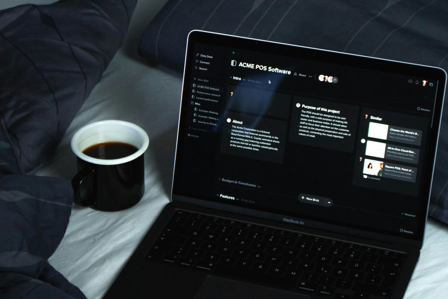
But here's the thing - and this is really important - bad dark mode is worse than mediocre light design. You can't just flip the colors and expect it to work. I learned this the hard way on some of my earlier projects. The contrast needs careful thought. Text legibility becomes crucial. Colors need to be chosen specifically for dark backgrounds, not just dimmed versions of what worked on white.
Through building many dark mode sites, I've gotten better at knowing what works. The right gray tones, proper contrast ratios, subtle touches that make dark interfaces feel polished. It's taken time to develop that eye, but now when I see a poorly done dark mode site, it's immediately obvious what's off.
The Design Challenge I Actually Enjoy
Building dark mode websites is objectively harder than building light ones. Colors behave differently. Shadows work in reverse - you're adding light instead of removing it. Images need different treatment. Text hierarchy requires more careful attention.
Honestly though? I kind of enjoy that challenge. There's something satisfying about solving the unique problems that dark mode presents. It forces me to think more deliberately about every design decision.
For example, pure white text on pure black backgrounds creates this harsh contrast that's actually harder to read than you'd think. The solution is using off-whites and dark grays instead of pure values. These subtle adjustments make a massive difference in how comfortable the site feels to use.
Same goes for accent colors. That bright blue that looks great on white might feel overwhelming on black. You need to adjust saturation and brightness to maintain visual balance. It's detailed work, but I find it satisfying when it comes together.
Why It Works for Modern Brands
I've noticed that dark mode particularly suits certain types of businesses. Tech companies, creative studios, modern startups - they all seem to benefit from the contemporary feel that dark interfaces provide.
There's also this practical advantage: a well-executed dark mode website stands out. When most sites in your industry use light backgrounds, switching to dark immediately differentiates you. It signals that you're thinking differently about design, that you're not just using the same template as everyone else.
That said, I don't think dark mode works for everyone. E-commerce sites with lots of product photos often work better with light backgrounds. Traditional industries might find dark themes too bold. Content-heavy sites with long reading sessions sometimes benefit from light backgrounds.
The key is matching the design to the brand and context. Dark mode isn't universally better - it's better for specific situations, and figuring out when those situations apply is part of the job.
The Increasing Expectation
What I find interesting about the dark mode movement is how quickly it went from preference to expectation. Users now actively look for dark theme options. When a site doesn't offer one, I hear about it.
Major platforms led this shift. When iOS and Android both introduced system-wide dark mode, they legitimized it as standard rather than novelty. When Twitter, Reddit, YouTube added dark themes, they trained millions of users to expect that option.
I see this reflected in my projects. Five years ago, clients occasionally asked about dark mode. Today, it's regularly part of the initial conversation, especially for tech-forward brands.
The technical side has evolved too. Modern CSS makes dark mode implementation much more practical. Media queries can detect system preferences, CSS variables make theme switching elegant, and we have better tools for maintaining accessible contrast ratios. The technology caught up to the demand.
My Default Starting Point
I'll admit something: when I start designing a new website, I often begin with the dark mode version first. It's become my natural starting point, especially for tech projects.
This might sound backwards, but there's logic to it. If I can make the design work on a dark background with all its constraints, adapting it to light is straightforward. The reverse isn't always true - a design that works perfectly on white might fall apart when moved to dark.
Starting with dark mode also forces me to think harder about hierarchy, spacing, and typography from the beginning. Those fundamentals need to be stronger in dark interfaces, so addressing them early results in better overall design.
The Bottom Line
Dark mode feels right for modern websites because it matches how people actually use the web today. We're on our devices more, for longer periods, in varying lighting conditions. A design approach that's easier on the eyes while looking contemporary just makes sense to me.
The growing preference for dark mode isn't random. It's driven by real user comfort, changing aesthetic expectations, and better technology to implement it well. As someone building websites daily, I see these factors converging into something that feels less like a trend and more like where things are naturally heading.
I'm not saying every website should be dark. But for many modern brands, especially in tech and creative spaces, dark mode isn't just an option anymore - it's increasingly what users expect and prefer.
The challenge is execution. Understanding the nuances that separate good dark design from just inverting colors takes experience. After building many dark mode interfaces, I've developed some intuition for what works. And what I keep coming back to is this: when it's done right, it doesn't just look good - it feels right. It feels modern and purposeful.
The web is moving toward darker interfaces, and I think that's actually a good thing. It's better for users during long browsing sessions, it creates opportunities for interesting visual design, and it pushes us to think more carefully about our work. For modern websites, dark mode just makes sense.